
Genomics 3 - Workshop 5: scRNAseq
Welcome to Workshop 5! In the last workshop we worked on bulk RNAseq data - i.e. we derived a single, averaged transcriptome for entire populations of cells, and then compared different conditions to see what was different. In a cell culture system a homogenous response may be biologically accurate (although not always...), but in reality cells are independent entities, even highly similar cells. Differences may be minor, almost technical, based on cell cycle stage for example, or it could be that your population has completely different cell types in it. The latter context is what we will consider in this workshop as we work with single cell RNA sequencing (scRNAseq) data derived from human bladder cancers - "urothelial carcinoma".
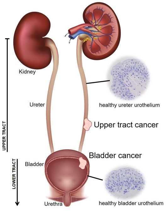
Cancers are complex ecosystems. For bladder cancer, the actual cancer consists of dysregulated urothelial cells - the epithelial cells which line the bladder wall (and the upper urinary tract up the ureters and into the renal pelvis of the kidney). But surgical samples do not just contain these urothelial carcinoma cells. We also capture white and red blood cells, fibroblasts, muscle etc. etc. Some of these cells may be genuinely part of the tumour microenvironment (TME) or it could be that the surgeon also sampled some normal(ish) tissue which was next to the main tumour (paracancerous).
This is really important as patients with tumours which are heavily infiltrated (lots of immune cells within the TME) tend to do better than those where the tumour is evading immune surveillance. Infilitration is often used as a marker of treatment success (or resistance).
Whilst a bulk transcriptome averages out the transcriptomes of all cells in a population (e.g. making a very murky cancer plus immune plus RBCs plus muscle picture, where the murkiness may be different between patients, but only for technical reasons, not biological), scRNAseq allows you to identify different cell types in your data. You can work with these independently (effectively filtering out the noise) or you can study interactions, changes in function etc. etc. - we’re still only in the infancy of working out how scRNAseq can aid our research questions.
One thing to remember is that scRNAseq still has some drawbacks:
- scRNAseq still loses all positional information from a dataset, for that you need spatial transcriptomics (and lots of £££)
- You can look at heterogeneity, but you can only sample a (relatively) small number of cells (typically ~10k per sequencing run - bulk will have RNA from a population often in excess of 1M cells)
- There is a limit of detection - genes with low expression will be poorly represented
These are important points to consider as you do your analysis (and when you’re interpreting the data).
Introduction to the material
Raw scRNAseq data can be massive (>200M reads per file is standard), so we're starting with data which has already been mapped and quantified to the gene level. In this workshop you will work exclusively in R, but using RStudio (nice and familiar), but still on the Linux system. The workshop is aimed towards the dual-boot Linux machines in G/N/169, but in theory you could do this analysis on a Windows machine. We do not recommend this however, as working on the managed machines means you have access to all the data, any workshop-required R libraries have been installed for you already, and you have increased computational power working on Linux rather than Windows.
In the workshop you will start with genome-mapped data. You will perform QC and filtering to keep only high quality and informative cells. You will perform dimension reduction, clustering, community annotation, differential expression, gene set enrichment analysis and functional annotation - lots of graphs.
If you choose to base your final report on this workshop, you will need to expand/adapt the analysis in the workshop to some related, but different data we have provided. The bioinformatic approach will be very similar, but you will need to address an appropriate question for your chosen dataset, and bring in the relevant biology. More details on these options are at the end of the workshop material.
The workshop
Research Question
Cancer "T" stage is determined by how invasive the cancer has become. If a growth of cells is contained to its layer of origin (the urothelium in our case, including the bladder lumen as this is acellular space, not another tissue), it isn't really a cancer. These Ta "tumours" are considered worth removing in bladder cancer because having a Ta tumour is a major risk factor for developing subsequent invasive disease. T1 tumours invade through the basement membrane into the lamina propria (the stroma, where blood cells, fibroblasts, neurones etc. are). T2 and T3 tumours are different extents of muscle-invasive disease, and T4 tumours have escaped the bounds of the bladder, with metastasis highly likely if not evident at bladder cancer diagnosis.
This is summarised nicely in this 2015 bladder cancer review with Figure 1 included below.
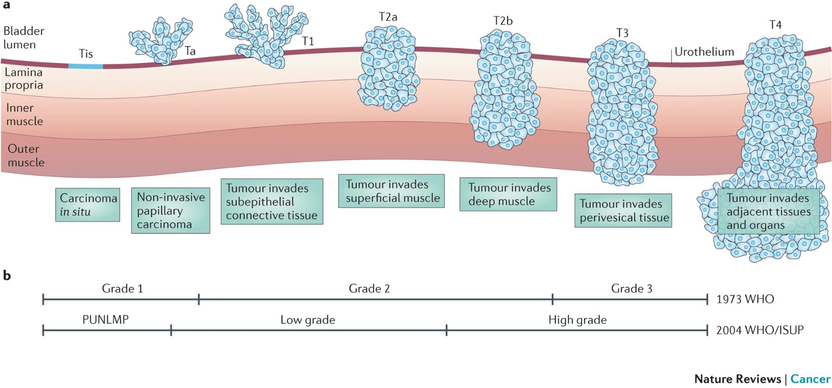
Around 80% of people present at non-muscle-invasive stage (NMIBC) and 5-year survival is pretty good. However muscle-invasive (MIBC) disease has a 5-year survival lower than 50%, even with the standard-of-care radical treatment of removing the bladder. In this workshop you will work with scRNAseq data from a T1 tumour and a T3 tumour to identify whether there are differences between the malignant cells and tumour microenvironment between these tumour stages. These data were derived from Lai et al. (2021) published in the International Journal of Cancer.
| Sample | Age | Sex | T stage | Grade | Cell number (preQC) |
|---|---|---|---|---|---|
| BC2 | 67 | M | T1 | High | 11428 |
| BC5 | 81 | M | T3 | High | 10592 |
Workshop Aims
- Quality check your scRNAseq data, removing uninformative or low quality cells
- Apply appropriate techniques for identifying distinct clusters of similar cells
- Explore the biology of these communities through annotation, differential expression and functional characterisation
- Compare alike cells between two different samples
0 Set up your directories, paths and RStudio project
Remember, you should be working on a Linux machine in G/N/169 for this workshop.
Assuming that you are, first open the terminal and set up your directories:
# change into your student directory
# this assumes you have made a directory which matches your username exactly - change if needed
cd /shared/biology/bioldata1/bl-00087h/students/${USER}/

# create directories for this workshop, and set their permissions
mkdir workshop5 workshop5/data workshop5/plots workshop5/libs
chmod -R 775 workshop5

# create appropriate symbolic links
cd workshop5/data
ln -s /shared/biology/bioldata1/bl-00087h/data/singlecell_rnaseq_data/01_workshop/* .

cd ../libs
ln -s /shared/biology/bioldata1/bl-00087h/data/singlecell_rnaseq_data/R_4.3.3 .

## you can now exit the terminal
That's right! All being well, that is the only work you'll need to do at the terminal today.
Now, open the Apps menu and open RStudio. This should feel familiar. You need to use all the good practices your learned in first and second year - do revisit Emma Rand's first year material and your BABS module VLEs if you need a refresher.
Let's get set up:
- Open a New Project
- Choose an Existing Directory
- Browse
- Click the left arrow next to your username at the top, click the one which looks like a disk (first icon, to left of
home) - Navigate through shared > biology > bioldata1 > bl-00087h > students > your username > workshop5
- Then select Open (top right), then Create Project
- Ignore any updates etc.
workshop5.R or similar, and add the following lines to the top:
# access the Genomics shared libraries with this command
.libPaths("libs/R_4.3.3")

# load relevant libraries
library(tidyverse)
library(Seurat)
library(clustree)
library(ggplot2)
library(ggrepel)
library(fgsea)
Just like in previous courses, your RStudio script file workshop5.R is now your workbook for the session. Keep your comments and notes here, and run all your code from it. Remember that you are now working with properly big data - some commands take time. I will highlight a couple of longer steps - the sample integration takes about 10 minutes, the DEA takes about 5 minutes.
OK. You should now be set for the workshop. Let's get started!
What to do if you don't or can't work in G/N/169.
The best option is to work in G/N/169. But if this isn't possible you can complete the work using RStudio on your own machine (or a University Windows one). You would need to install all R libraries and their dependencies yourself, dealing with any R version issues or differences yourself. I have provided zero support for this option beyond the tips below.
Check if the library is already on your machine (e.g. tidyverse may be there already), but if not, use: install.packages("tidyverse", dependencies=TRUE)
fgsea may not work on Windows (the line of code should run in about 10 seconds - longer than a minute and it isn't working). You could try enrichplot and clusterProfiler instead. For this you need to install BiocManager in the normal way, and then use:
BiocManager::install(c("clusterProfiler", "enrichplot", "org.Hs.eg.db"), dependencies=TRUE). This is quite a good tutorial for how to use these packages. Complicated? Definitely more than using G/N/169...
The workshop material can be downloaded here.
I have now managed to get this working on teaching0 - but you would need to do all the R work at the command line. There is no RStudio functionality on teaching0. For the libraries you should use .libPaths("/shared/biology/bioldata1/bl-00087h/data/singlecell_rnaseq_data/R_4.3.3_teaching0")
You would need to follow the workshop, but all at the command line. You would need to save each plot using a command line ggsave("res005_UMAP.png")ad then use WinSCP/FileZilla/ftp to download and look at it. Again, more complicated than completing the material in G/N/169 if you can get there.
1 Load and set up your data object
Unfortunately we couldn't get you working with the raw FASTQ files for this workshop. The raw data was over 40GB per sample and on the University's HPC it took over 12 hours using 50GB of RAM to align each sample to the reference transcriptome.
So, you have been provided with a directory with the aligned and sample-normalised data for the workshop. You will load this, create the metadata (always the samples used in alphabetical order), and build the Seurat object. Seurat is the name of the commonly used package for scRNAseq data derived by 10x Genomics. It is a massive R package with lots of constantly updating functionality. It is always good to revisit how you analyse scRNAseq data. In 2022 more scRNAseq bioinformatic tools were published than scRNAseq datasets...
## have some kind of obvious section header (you could use the workshop section header...)
## remember to use commands like head to explore the data objects as you make them

# load the data - this will take ~5 mins (so read ahead)
counts <- Read10X("data/")

# check dimensions (number of genes, number of cells)
dim(counts)

# set the sample IDs and conditions (T stages) for the counts object
ids <- c("BC2", "BC5")
con <- c("T1", "T3")

# use labels to annotate data and create metadata dataframe
# set up sample and conditions labels for the backgrounds
cell_counts <- table(substring(colnames(counts),18))

samples <- c()
for (s in 1:length(ids)) {
  samples <- c(samples, (rep(paste(ids)[s], cell_counts[s])))
}
conditions <- c()
for (c in 1:length(con)) {
  conditions <- c(conditions, (rep(paste(con)[c], cell_counts[c])))
}

# create metadata df
metadata <- data.frame(Sample=samples, Conditions=conditions, row.names=colnames(counts))

# check metadata dataframe cell numbers match expected
# data in table in Research Question section above
metadata |> group_by(Sample) |> summarise(Cells=n())
metadata |> group_by(Conditions) |> summarise(Cells=n())

# create Seurat object from the data
so <- CreateSeuratObject(counts=counts, project="Genomics_W5", meta.data=metadata)
Idents(so) <- so@meta.data$Conditions

# these datasets get big, so we need to occasionally tidy up our memory, removing unused variables
rm(c, s, cell_counts, con, conditions, ids, samples, counts, metadata)
2 Data QC
As with any dataset, there are often low quality or low confidence data we need to quantify and then control for, either by removing or regressing (statistically accommodating). We will do the former.
scRNAseq focuses on 3 main issues:
- Mitochondrial transcripts - high MT% can be indicative of cells dying. In whole blood samples healthy cells will have less than 5% of their transcripts coming from MT genes. In epithelial tissues this can reach >20%.
- Low numbers of features - often correlated with cells with high MT%, cells which have very few identified genes are unlikely to be informative in clustering, and could be dying cells.
- High numbers of features - capturing lots of data is great, but if you get too many unique genes identified this could suggest that 2 cells entered the oil droplet library preparation used by 10x Genomics. If the 2 cells are very similar it wouldn't matter greatly, but if it is a macrophage engulfing a dying epithelial cell, the "cell" would be a major outlier.
Hopefully you're already getting the uneasy feeling that this QC is very subjective. The aim here is to be consistent, logical and transparent in what you do. Remember, you have thousands of cells. Better to be harsh and throw away possible junk, than have it carry through your entire analysis and undermine your results.
#identify % MT
so <- PercentageFeatureSet(so, pattern="^MT-", col.name="percent.mt")

# violin plot of features, counts, MT%
VlnPlot(so, features=c("nFeature_RNA","percent.mt"),
  ncol=2, pt.size=0, group.by="Sample", raster=FALSE)
We have some variability between our two samples here. We can create a summary table, and then scatter our two variables (remember these are related in certain conditions).
# take the metadata and summarise key statistics (feel free to play with this)
summary_metadata <- so@meta.data |> group_by(Sample) |> summarize(mt_med = quantile(percent.mt, 0.5),
                                            mt_q95 = quantile(percent.mt, 0.95),
                                            mt_q75_plus_IQR = quantile(percent.mt, 0.75) + (1.5 * IQR(percent.mt)),
                                            feat_med = median(nFeature_RNA),
                                            feat_q95 = quantile(nFeature_RNA, 0.95),
                                            feat_q75_plus_IQR = quantile(nFeature_RNA, 0.75) + (1.5 * IQR(nFeature_RNA)),
                                            count = n())

# print the table
summary_metadata

# graph MT% against number of unique features
ggplot(so@meta.data, aes(nFeature_RNA, percent.mt, colour=Sample)) +
  geom_point(alpha=0.2) +
  facet_grid(.~Sample) +
  theme_bw()
The idea here is to remove the low feat/high MT cells, plus the high feat cells to leave us with a high confidence group of cells with low contamination. We try to be educated in the thresholds we choose. One way of doing this is the UQ + (1.5*IQR) rule.
# find the upper threshold limit for MT% in both samples, then take the lowest value
mt_filt <- min(summary_metadata$mt_q75_plus_IQR)

# find upper threshold limit for feature number in both, then take the lowest value
feat_max_filt <- min(summary_metadata$feat_q75_plus_IQR)

# print proposed thresholds
mt_filt
feat_max_filt

# low feature is much more subjective - let's try 2 graphs
# first a zoomed in view of the scatter above
ggplot(subset(so@meta.data, subset = percent.mt < 10), aes(nFeature_RNA, percent.mt, colour=Sample)) +
  geom_point(alpha=0.2) +
  facet_grid(.~Sample) +
  theme_bw() +
  xlim(0,1500)

# second, a density plot of a similar range (extended so the density doesn't drop off artificially)
ggplot(so@meta.data, aes(x=nFeature_RNA, colour=Sample)) +
  geom_density() +
  facet_grid(.~Sample) +
  theme_bw() +
  xlim(0,2500)
Essentially we want to see a dense cloud of cells (dots) with low numbers of features then a gap, then another dense cloud (more reliable numbers of features).
The first plot doesn't really show it (sometimes it is very obvious). But the second shows the peak, dip, peak we're looking for, with the dip around 1200 in both. So we'll use that as our lower end threshold.
# subset on lower and upper feature number and MT%
so <- subset(so, subset = nFeature_RNA >= 1200 & nFeature_RNA <= feat_max_filt & percent.mt <= mt_filt)

# re-generate summary data for the filtered dataset
so@meta.data |> group_by(Sample) |> summarize(mt_med = quantile(percent.mt, 0.5),
                                            mt_q95 = quantile(percent.mt, 0.95),
                                            mt_q75_plus_IQR = quantile(percent.mt, 0.75) + (1.5 * IQR(percent.mt)),
                                            feat_med = median(nFeature_RNA),
                                            feat_q95 = quantile(nFeature_RNA, 0.95),
                                            feat_q75_plus_IQR = quantile(nFeature_RNA, 0.75) + (1.5 * IQR(nFeature_RNA)),
                                            count = n())

VlnPlot(so, features=c("nFeature_RNA", "percent.mt"),
  ncol=2, pt.size=0, group.by="Sample", raster=FALSE)

## Lots of good work done here, so let's create a save point in case something goes wrong later
save.image("savepointA_QC-complete.RData")
You may feel dissatisfied with the relatively arbitrary nature of these cut-offs. You may be concerned that you've applied the same filters to two different datasets with different starting distributions (and biology, perhaps). These are good concerns to have - be critical of your decisions the whole way through. The levels I've done here are fairly consistent in the literature, but the literature has been developed on whole blood leukocyte preps - that's not what we're studying.
3 Data integration
Integrating samples is crucial if you want to compare them. Typically single cells from a person are more similar to each other (due to biology and technical reasons) than they are to the same cell type from a different person. Without integration different donors would sit separately at all stages of clustering and analysis, which isn't necessarily very helpful.
For example, below is the initial mapping analysis downsampled t-SNE of the two samples you're using in this workshop - they are almost completely distinct.
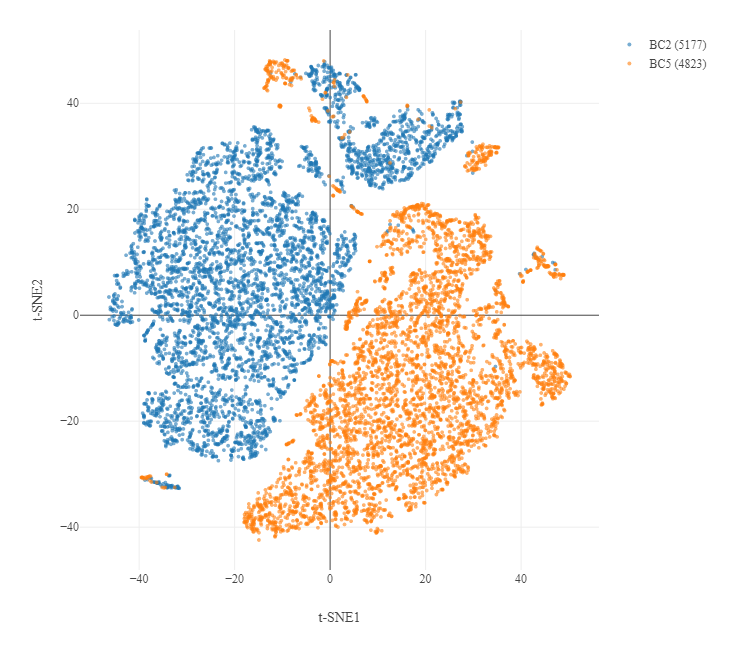
This is a combination of a biological and technical batch effect in the data. Where possible we want to control technological batch effects (i.e. samples run on different days, prepped by different people) but keep biological differences. This needs to be done carefully.
We will do this in 4 steps:
- Look for the genes with highest variance across each sample.
- Compare how similar the most variable genes are between the 2 samples.
- Find features (genes) which are variable in both samples and use these as anchors for integrating and normalising our two samples together so they can be analysed as one large sample
- Scale and centre each gene so highly variant and highly abundant genes don't overpower our later clustering.
Step 3 here is the one which takes time. In the workshop it will take about 10 minutes. This part scales very badly - it's why you're only working with 2 samples and not more - the computational expense increases exponentially as you add more samples. So let's get started!
# split object by conditions (T1 and T3)
con.list <- SplitObject(so, split.by = "Conditions")

# normalize and identify variable features for each dataset independently
con.list <- lapply(X = con.list, FUN = function(x) {
  x <- NormalizeData(x, normalization.method = "LogNormalize")
  x <- FindVariableFeatures(x, selection.method = "vst", nfeatures = 3000)
})

# Standard approach is now to integrate the two conditions based on shared variable features. Does this artificially make the two conditions more similar?
# we looked for 3000 variable features. If the shared variable features are close to 3000 this is bad as we'll likely lose biological differences, but we do need some so we can anchor datasets together.
# Somewhere between 600 and 2400 is fine - closer to halfway the better
length(intersect(VariableFeatures(con.list$T1), VariableFeatures(con.list$T3)))

# select features repeatedly variable across datasets for integration
intfeats <- SelectIntegrationFeatures(object.list = con.list, nfeatures = 3000)

# integrate datasets using anchors
# this will take 10 minutes...
int.anchors <- FindIntegrationAnchors(object.list = con.list, anchor.features = intfeats)
so_donorint <- IntegrateData(anchorset = int.anchors)

# scale data after integration (mean=0, var=1)
DefaultAssay(so_donorint) <- "integrated"
so_donorint <- ScaleData(so_donorint, features = rownames(so_donorint))

# clear up
rm(con.list, int.anchors, intfeats, so)

# save checkpoint
save.image("savepointB_QC-integration-complete.RData")
4 Find clusters of cell types
Now we're happy with the data quality, and we've joined our two samples together into a single analysis object, we can try and look at the biology! To do this we need to use machine learning approaches to identify communities of cells which are alike.
Not all genes are equally informative, particularly as genes work in pathways. We will first use PCA as a dimension reduction technique to identify patterns of shared variance we can use to derive communities (a bit subjective). We will then work out how many clusters are informative (very very subjective). Then we'll get plotting.
# run PCA
so_donorint <- RunPCA(so_donorint)

# by default this shows the top 5 PCs and which genes are the biggest contributors in each direction.
# you could google the top one in each direction - what does this tell you?

# rather than using all PCs, we want to pick the most informative
# we can look at how much variance each successive PC accounts for with an elbow pot
ElbowPlot(so_donorint)

# the elbow is where the graph stops going steeply down and flattens out
# you would consider this the end of the informative PCs - but where does it go flat?

# we can approach this a bit more mathematically
pct <- so_donorint[["pca"]]@stdev / sum(so_donorint[["pca"]]@stdev) * 100
cumu <- cumsum(pct)

# point where 50% variance covered and next PC gives less than 5% contribution
co1 <- which(cumu > 90 & pct < 5)[1]
co1

# point where the contribution step between PC drops below 0.1
co2 <- sort(which((pct[1:length(pct) - 1] - pct[2:length(pct)]) > 0.1), decreasing = T)[1]
co2

# select min of these two measures
pcs <- min(co1, co2)
pcs

# this is a comparison between 1) the point where 90% of the variance is accounted for, and 2) where each PC doesn't add that much more information - we pick the smaller
# we can visualise the predicted elbow point
# Create a dataframe with values
cumu_df <- data.frame(pct = pct, cumu = cumu, rank = 1:length(pct))

# Elbow plot to visualize
ggplot(cumu_df, aes(cumu, pct, label = rank, color = rank > pcs)) +
  geom_text() +
  theme_bw()

# clean up
rm(pct, cumu, cumu_df, co1, co2)

# we can now check the 4 top component variable genes to see if the PCA reduction has been successful
# cells expressing these markers are shaded from dark blue (most expression) to pale pink (least/none)
FeaturePlot(so_donorint, reduction = "pca", dims = c(1, 2),
  features = c("VIM", "FXYD3", "SPARC", "C1QC"), cols = c("#fcd5ce", "#4886af"),
  pt.size = 2.5, alpha = 0.7, order = TRUE,)
Our data are being spread just across these first 2 main PCs. This is particularly great as these genes are typically markers of different cell types we would see in tumours. More on that later.
# to form communities we need to find how each cell relates to every other cell using neighbor analysis
DefaultAssay(so_donorint) <- "integrated"
so_donorint <- FindNeighbors(so_donorint, dims = 1:pcs)

# Neighbor analysis finds possible communities, but doesn't tell us how many communities there *should* be
# Community detection always starts with all the cells in 1 community, then perform successive subdivisions
# we can visualise how the communities are derived and subdivide using a cluster tree

# iterate through multiple potential resolutions
# clustree to find the best resolution
so_donorint_orgs <- FindClusters(so_donorint, resolution = seq(0, 0.3, 0.05))
clustree(so_donorint_orgs, show_axis = TRUE) + theme(legend.position = "none") + ylab("Resolution")

# tidy up
rm(so_donorint_orgs)
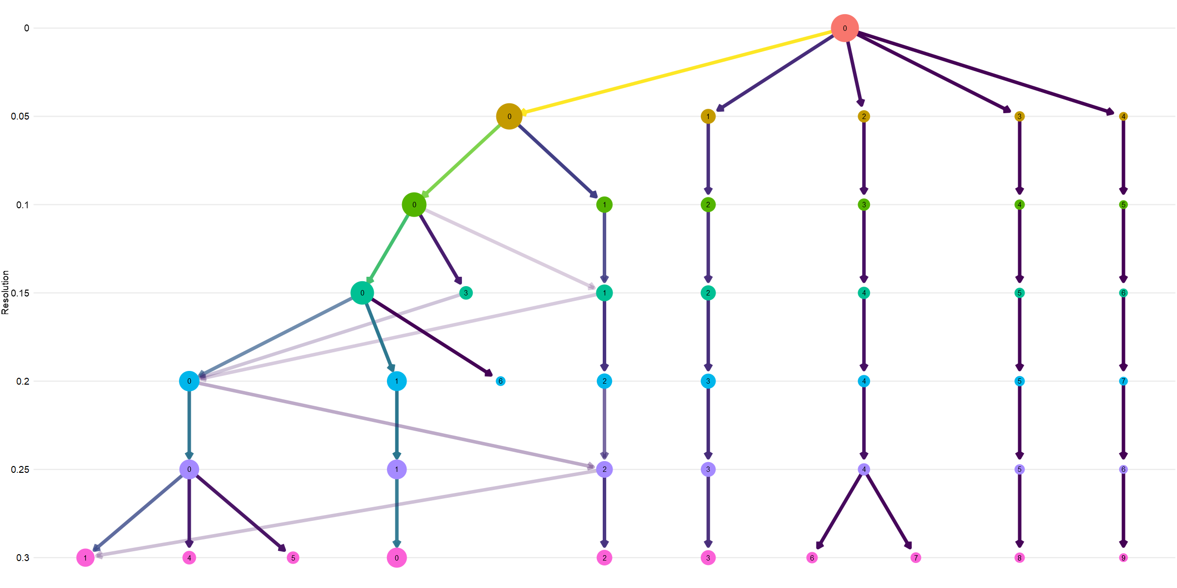
The top of the plot shows all cells together, then the subdivisions. You can see most communities are evident from almost the very start, showing clear separation in cell types likely reflecting genuine biological differences. You can see a later subdivision of community 2, and the 0 community splits, merges, mixes as the resolution changes.
It is exciting to try and find new cell types with scRNAseq, but often you end up with many subgroups of the most numerous type, because it is the most numerous (not necessarily due to differnet biology). It is therefore always wise to start your analysis at a low resolution where the main community lineages are separate. We will choose 0.05 here.
# Set resolution
res <- 0.05

# generate UMAP from SNN projection with desired resolution
so_donorint <- FindClusters(so_donorint, resolution = res)
so_donorint <- RunUMAP(so_donorint, dims=1:pcs, return.model = TRUE, verbose = FALSE)

# overall plot
DimPlot(so_donorint, reduction = "umap", label = TRUE, label.size = 6)

# splits
DimPlot(so_donorint, reduction = "umap", split.by = "Conditions", label = TRUE, label.size = 6)

# print the proportions in each group for each sample
round(prop.table(table(Idents(so_donorint), so_donorint$Conditions))*100,3)
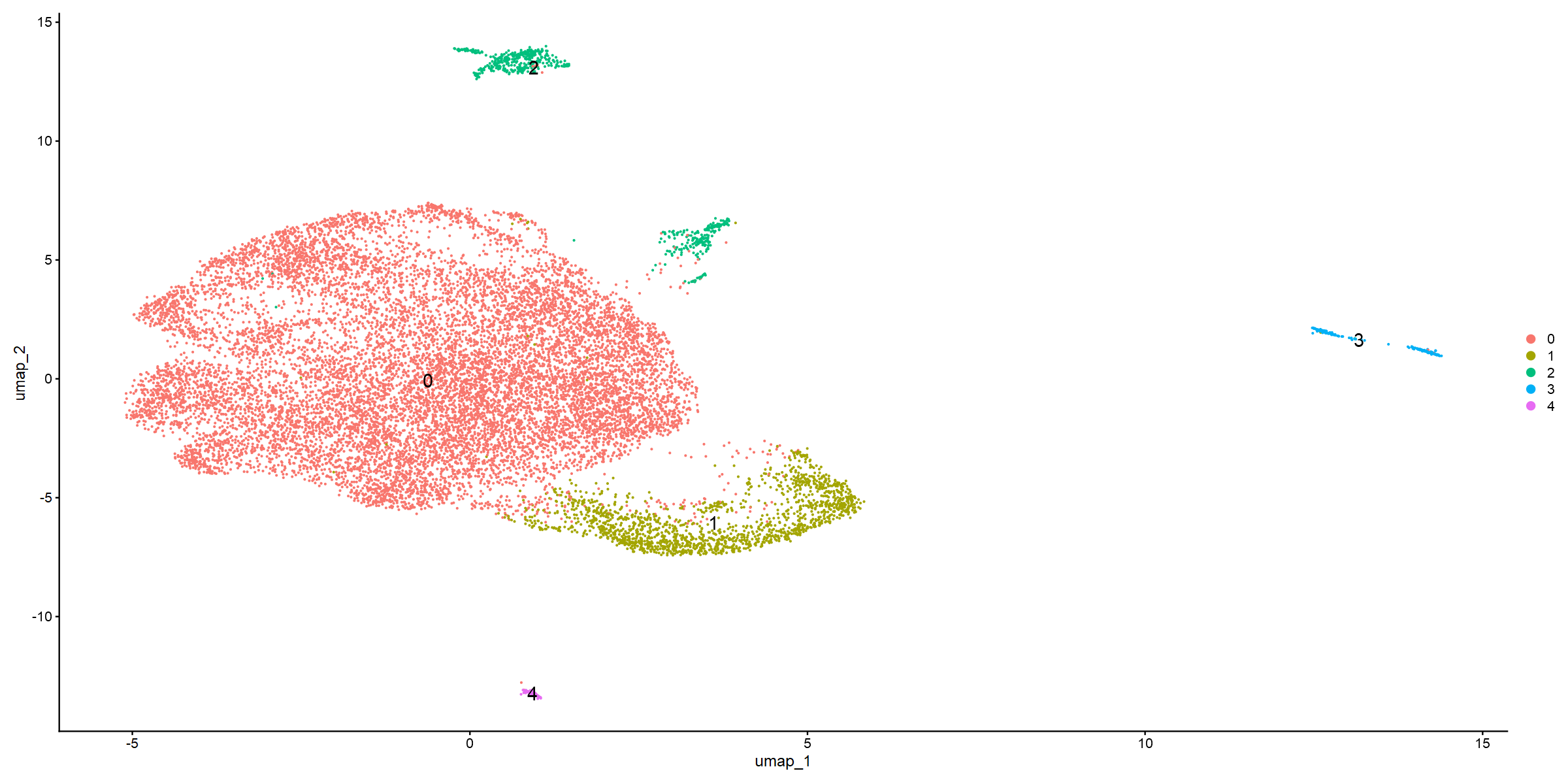
This first UMAP shows clear separation. It does also look like community 2 and community 3 should/could be subdivided further. The UMAP which splits by donor also suggests some differences. Communtiy 3 is almost absent in the T1 tumour, and there are some distribution differences in community 0.
But what are the cells in these communities?
5 Annotate clusters
There are tools to try and automate cell type annotation, but these are often geared towards blood or are very difficult to install and run. So we will use some published markers instead.
# change the assay type for plotting and re-normalize
DefaultAssay(so_donorint) <- "RNA"
so_donorint_dp_norm <- NormalizeData(so_donorint, verbose = TRUE)

# define list of gene markers for likely communities
features <- c("UPK2", "KRT13", "EPCAM", "KRT18",  #urothelial markers
            "COL1A1", "CALD1",                    #muscle markers
            "DCN", "PDPN", "TAGLN",               #fibroblasts
            "PECAM1", "VWF", "CLDN5",             #endothelial
            "CD2", "CD3D", "CD3E",                #T cells
            "C1QC", "CD14", "CSF1R")              #macrophages/myeloid

# use these markers to ceate a dotplot showing the intensity and proportion of cells expressing each marker in each community
DotPlot(so_donorint_dp_norm, features = features, dot.scale=8) +
  theme(axis.text.x = element_text(size = 11)) +
  RotatedAxis ()

# we can double check how specific these markers are with FeaturePlot
FeaturePlot(so_donorint_dp_norm, reduction = "umap",
            pt.size = 2, alpha = 0.7, order = TRUE,
			features = c("UPK2", "EPCAM", "DCN", "PECAM1", "CD2", "C1QC"))
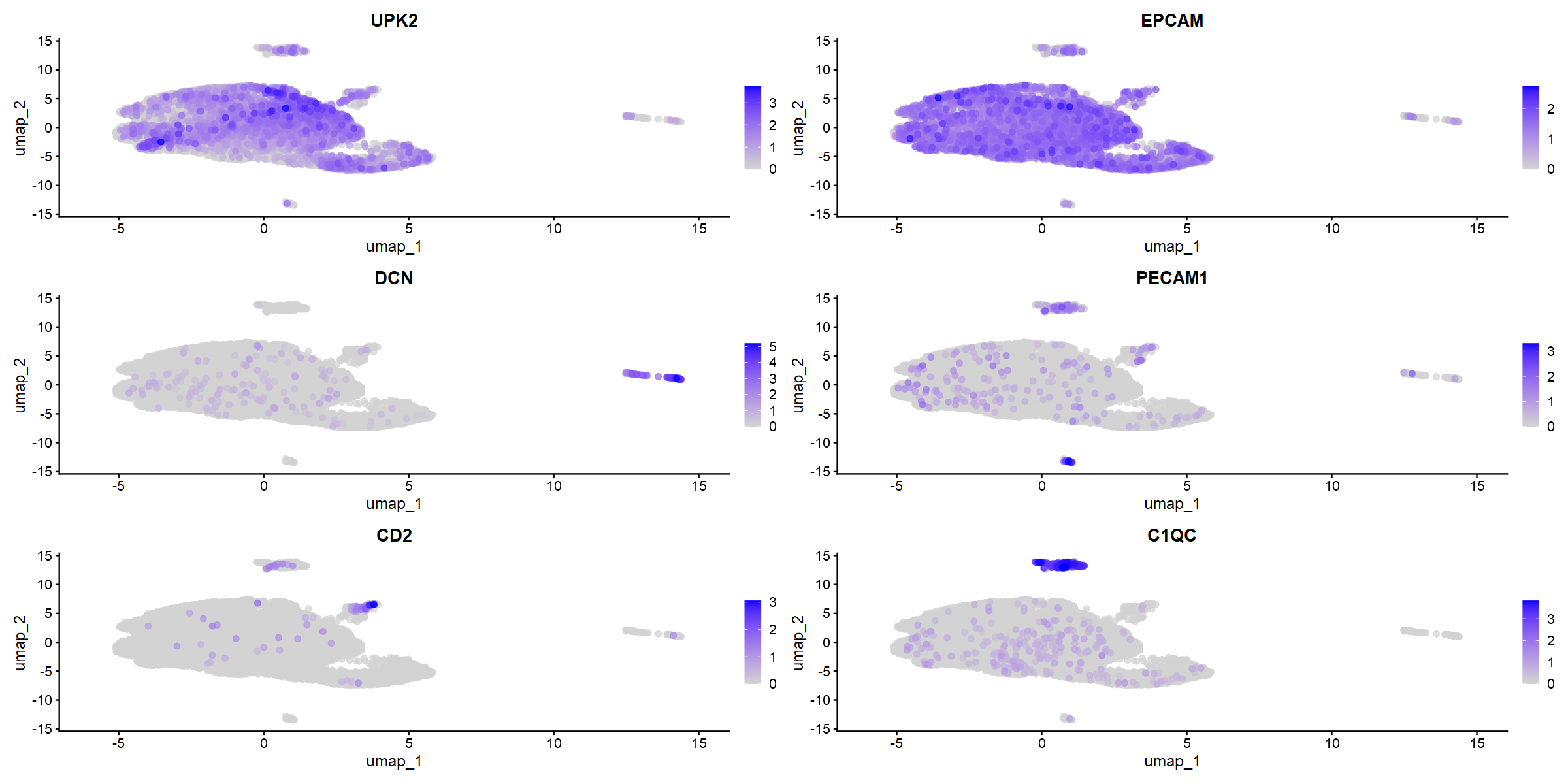
The markers do seem to be very specific. Some nice obvious things - community 3 appears to be fibroblasts and muscle, and this group is smaller in the T1 tumour (which is not muscle-invasive). So that's nice validation.
Communities 0 and 1 appear to contain epithelial markers - but that group separated very early in the clustree - so what is the difference between them? We can run differential expression analysis (DEA).
DEA with scRNAseq is fundamentally similar to the bulk DEA we did in workshop 4. But the stats are a bit different. The dataset is technically massive (very high n in each group) so you can get very (very) small p values. But the dynamic range in transcript detection is quite small, so fold changes can be very small but still important. Our dataset is big, so there are big differences - but something to keep in mind.
# switch back to integrated assay for comparisons, not plotting
DefaultAssay(so_donorint) <- "integrated"

# run DEA - this may take ~5 minutes (and will produce warnings from R)
uro.markers <- FindMarkers(so_donorint, ident.1 = 0, ident.2 = 1)

# check output
head(uro.markers)

# create a p value ceiling to get rid of the 0s
uro.markers["p_val_adj"] <- lapply(uro.markers["p_val_adj"], pmax, 1e-300)

# set up ready for volcano plot, like in workshop 4
uro.markers$DEA <- "NO"
uro.markers$DEA[uro.markers$avg_log2FC > 1 & uro.markers$p_val_adj < 0.05] <- "UP"
uro.markers$DEA[uro.markers$avg_log2FC < -1 & uro.markers$p_val_adj < 0.05] <- "DOWN"
uro.markers$genes <- rownames(uro.markers)

# volcano plot
ggplot(uro.markers, aes(x=avg_log2FC, y=-log10(p_val_adj))) +
  geom_point(aes(colour = DEA), show.legend = FALSE) +
  scale_colour_manual(values = c("blue", "gray", "red")) +
  geom_hline(yintercept = -log10(0.05), linetype = "dotted") +
  geom_vline(xintercept = c(-1,1), linetype = "dotted") +
  theme_bw() +
  theme(panel.border = element_blank(), panel.grid.major = element_blank(), panel.grid.minor = element_blank(), axis.line = element_line(colour = "black")) +
  geom_text_repel(data=subset(uro.markers, (abs(avg_log2FC) > 4 & p_val_adj < 0.05)), aes(x=avg_log2FC, y=-log10(p_val_adj), label=genes), max.overlaps = 1000, size=4.5)
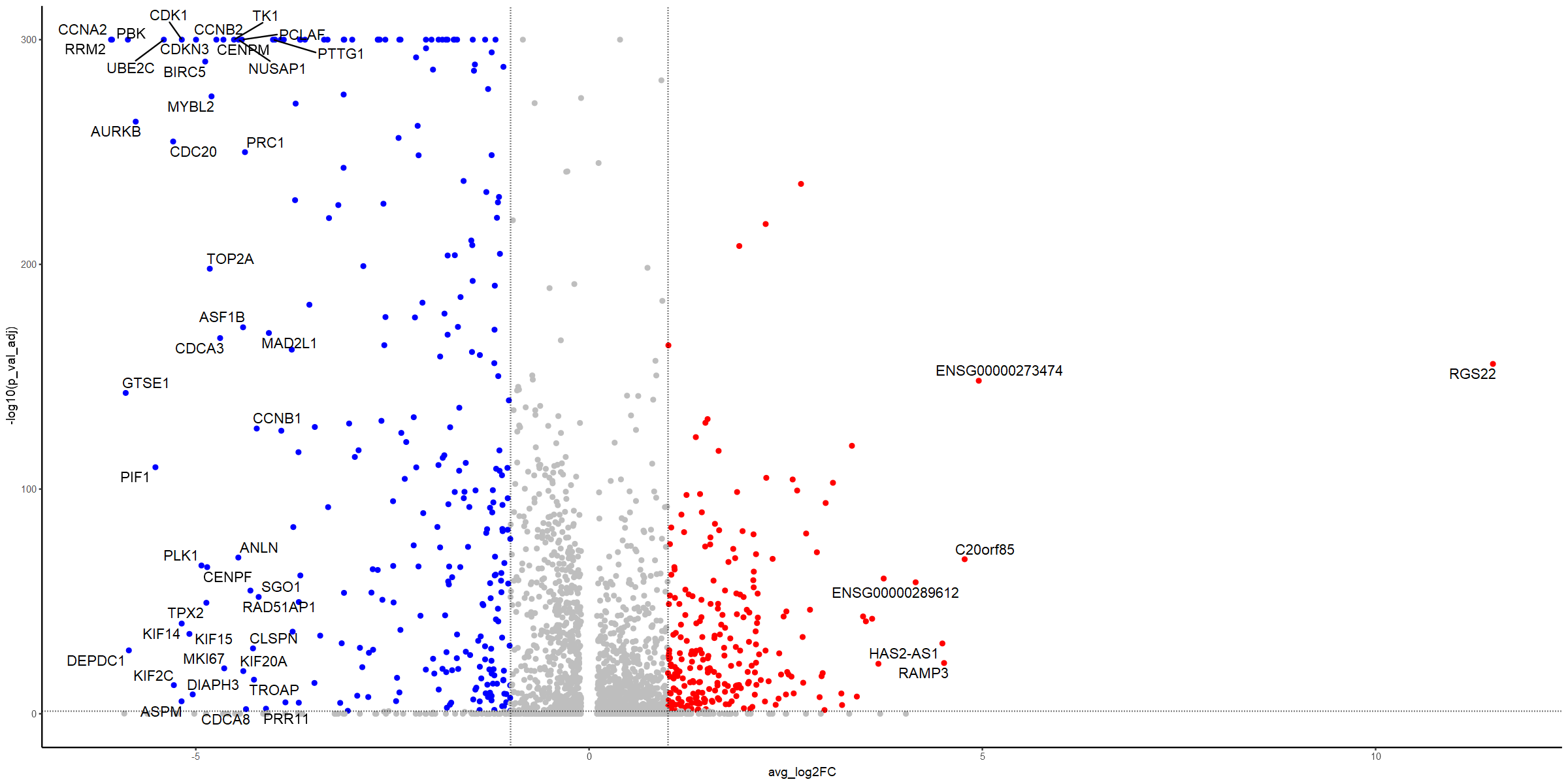
Lots of changes here - so what do they mean? Lots of cell cycle regulators. So does cell cycle explain the difference?
# use built-in Seurat cell cycle analysis
so_donorint.cc <- CellCycleScoring(so_donorint, s.features = cc.genes$s.genes,
    g2m.features = cc.genes$g2m.genes, set.ident = TRUE)

# check output
head(so_donorint.cc)

# plot the cell cycle phase against the UMAP
DimPlot(so_donorint.cc, reduction="umap", split.by="Phase", label=TRUE, label.size=10)
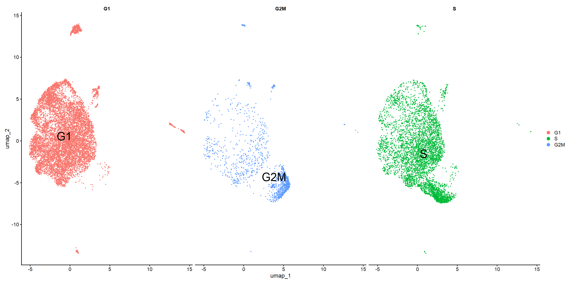
Community 0 appears to be enriched for G1. Community 1 for G2M particularly, but also S phase. Can we validate this with GSEA?
# define pi values
uro.markers <- mutate(uro.markers, pi = (avg_log2FC * (-1 * log10(p_val_adj))))

# prerank genes by pi values
prerank <- uro.markers[c("genes", "pi")]
prerank <- setNames(prerank$pi, prerank$genes)
str(prerank)

# load hallmarks gene set
genesets = gmtPathways("data/h.all.v2024.1.Hs.symbols.gmt")

# run gsea
fgseaRes <- fgsea(pathways = genesets, stats = prerank, minSize=15, maxSize=500)

# store top 10
top10_fgseaRes <- head(fgseaRes[order(pval), ], 10)
top10_fgseaRes

# G2M checkpoint is top!
plotEnrichment(genesets[["HALLMARK_G2M_CHECKPOINT"]], prerank) + labs(title="G2M checkpoint")
We've identified our communities now with marker genes, differential expression, cell cycle analysis and GSEA. So let's add names to our UMAP.
We've already highlighted some communities could do with further subdivision. If you wanted to do this, make sure you have DefaultAssay(so_donorint) <- "integrated" and then you could go back to the first UMAP plotting code block, changing the res value.
We won't do this now, but instead go back to the biological question.
# name clusters in numerical order
cluster_names <- c("urothelial_G1", "urothelial_G2M", "immune", "fibroblasts", "endothelial")
names(cluster_names) <- levels(so_donorint)
so_donorint <- RenameIdents(so_donorint, cluster_names)

# replot the UMAP
DimPlot(so_donorint, reduction = "umap", label = TRUE, label.size = 6) + NoLegend()

# save checkpoint
save.image("savepointC_QC-integration-annotation-complete.RData")
6 Are T1 and T3 malignant cells different?
The original question was about differences between T1 and T3 malignant cells. There's lots of ways we could attempt this: T1 vs T3 urothelial group, go to a higher resolution (more communities) or merge and regress the groups we want.
For this session we will compare community 0 between the two conditions. But some further code suggestions are given below if these ideas would be interesting to you for the assessment.
# make sure assay is integrated
DefaultAssay(so_donorint) <- "integrated"

# create labels for the two samples for community 0
so_donorint$celltype.condition <- paste(so_donorint$seurat_clusters, so_donorint$Conditions, sep="_")
Idents(so_donorint) <- "celltype.condition"

# perform DEA
uroG1_T1vsT3 <- FindMarkers(so_donorint, ident.1 = "0_T3", ident.2 = "0_T1", test.use = "bimod")

# check output
head(uroG1_T1vsT3)

# process as before ready for volcano plot
uroG1_T1vsT3["p_val_adj"] <- lapply(uroG1_T1vsT3["p_val_adj"], pmax, 1e-300)
uroG1_T1vsT3$DEA <- "NO"
uroG1_T1vsT3$DEA[uroG1_T1vsT3$avg_log2FC > 1 & uroG1_T1vsT3$p_val_adj < 0.05] <- "UP"
uroG1_T1vsT3$DEA[uroG1_T1vsT3$avg_log2FC < -1 & uroG1_T1vsT3$p_val_adj < 0.05] <- "DOWN"
uroG1_T1vsT3$genes <- rownames(uroG1_T1vsT3)

# plot
ggplot(uroG1_T1vsT3, aes(x=avg_log2FC, y=-log10(p_val_adj))) +
  geom_point(aes(colour = DEA), show.legend = FALSE) +
  scale_colour_manual(values = c("blue", "gray", "red")) +
  geom_hline(yintercept = -log10(0.05), linetype = "dotted") +
  geom_vline(xintercept = c(-1,1), linetype = "dotted") +
  theme_bw() +
  theme(panel.border = element_blank(), panel.grid.major = element_blank(), panel.grid.minor = element_blank(), axis.line = element_line(colour = "black")) +
  geom_text_repel(data=subset(uroG1_T1vsT3, (abs(avg_log2FC) > 8 & p_val_adj < 0.05)), aes(x=avg_log2FC, y=-log10(p_val_adj), label=genes), max.overlaps = 1000, size=4.5)

# create pi values
uroG1_T1vsT3 <- mutate(uroG1_T1vsT3, pi = (avg_log2FC * (-1 * log10(p_val_adj))))

# inspect the best hits
head(uroG1_T1vsT3)

# T3_top_20
uroG1_T1vsT3 %>% arrange(desc(pi)) %>% slice(1:20)

# T1_top_20
uroG1_T1vsT3 %>% arrange(pi) %>% slice(1:20)

# run GSEA
prerank <- uroG1_T1vsT3[c("genes", "pi")]
prerank <- setNames(prerank$pi, prerank$genes)
str(prerank)

# try some of the other gene sets to improve your understanding of the differences
genesets = gmtPathways("data/c2.cp.v2024.1.Hs.symbols.gmt")
fgseaRes <- fgsea(pathways = genesets, stats = prerank, minSize=15, maxSize=300, eps=0)

# check top GSEA hits for each side of the volcano
fgseaRes %>% arrange(padj) %>% filter(NES<0) %>% slice(1:20)
fgseaRes %>% arrange(padj) %>% filter(NES>0) %>% slice(1:20)

# final save
save.image("savepointD_QC-integration-annotation-biocomp-complete.RData")
You have all the data now to interpret the (many) differences between the T1 and T3 stages of the disease, at least for these 2 patients. The T1 seems to be incredibly proliferative, and the T3 has greater expression of invasive markers and ECM modifiers. Again, that makes sense. Use your remaining time to dig deeper. Google genes. Make new FeaturePlot output. What would you conclude?
Concluding remarks
Fantastic! You've taken scRNAseq data from two tumours, performed QC, community detection, identified the malignant cells rather than the other cell types which have either infilitrated the tumour or are in the tumour microenvironment, and then compared the malignant state between two tumour stages. Wow!
The cool thing is that you've been able to bring your RNAseq knowledge from workshop 4 to better understand and work with this data with much greater resolution. Do keep in mind the drawbacks of scRNAseq. It is still one of the new kids on the block, but make sure the use case is always well justified - it does, currently, cost a lot more than bulk RNAseq.
What to do if you want to do scRNAseq for your report
During this workshop you worked with and compared scRNAseq data from one T1 NMIBC (patient BC2) and one T3 MIBC (patient BC5). For your report you should work on one of the other paired sets we have generated for you. These data and the likely research question to investigate are indicated below.
Datasets:
/shared/biology/bioldata1/bl-00087h/data/singlecell_rnaseq_data/02_assessment_options/
assessment01_BC2-BC3 - Urothelial carcinoma heterogeneity within malignant NMIBC (BC2 vs BC3)
assessment02_BC1-BC6 - Urothelial heterogeneity within non-malignant NMIBC "papilloma" (BC1 vs BC6)
assessment03_BC4-BCN - Urothelial transcriptomes between malignant MIBC and paracancerous "normal" from one patient (BC4 vs BCN)
assessment04_BC2-BC6 - Urothelial transcriptomes between non-malignant papilloma and malignant NMIBC (BC6 vs BC2)
If you are doing this workshop on RStudio on Windows (don't!), the assessment material can be downloaded here.
Sample metadata
| Sample | Age | Sex | T stage | Grade | Cell number (preQC) |
|---|---|---|---|---|---|
| BC1 | 67 | M | Ta | Low | 8292 |
| BC2 | 67 | M | T1 | High | 11428 |
| BC3 | 38 | M | T1 | High | 27982 |
| BC4 | 80 | M | T2 | High | 37455 |
| BC6 | 58 | M | Ta | Low | 7863 |
| BCN | 80 | M | BC4 adjN | NA | 17213 |
For your analysis for the report, simply follow the start of the workshop, setting up a new RStudio project, creating symbolic links for the scRNAseq data etc., and then use the same analysis strategy as we did in the workshop. You will need to change some names, thresholds etc.
You are very welcome to analyse more than one paired set for your report, and bring in some interpretation or extended analysis from the workshop, perhaps. But, do not try to combine multiple pairs in a single analysis pipeline. This would be a great thing to do, if you had more computational time and memory. There are multiple steps which could take far too long to run on a standard machine as you increase the number of samples and cells. We have tested and adjusted these datasets to make sure they work for you!
The way to access the higher marks is to go beyond what we show you in the workshop material. This includes biological interpretation, but also showing us some independent bioinformatics.
There is more information on the assessment criteria on the VLE. Essentially we are looking for a decent introduction to the topic and relevance of the dataset, an explanation of your methods, and then your attempt to interpret the results and suggest how they address the purpose of the study.
Good luck, remember to support each other using the discussion boards, and do ask us for help and guidance if you need it.