
BABS4 - Data Workshop 4
Welcome to Data Workshop 4!
This is the second of two RNAseq workshops as part of the BABS4 (66I) "Gene expression and biochemical interactions strand". This material carries on directly from the material in workshop 3. If you need to re-do any of that workshop, or just need to refresh your memory, please follow this link to the previous material.
Introduction
In data workshop 3, you took a full RNAseq dataset from the Black et al. 2020 paper and eventually created a volcano plot showing the impact on the Haemophilus influenzae (Hi) transcriptome after cultures were transferred to starvation conditions for 30 minutes. A lot had changed, but what did it actually mean? This workshop is all about getting you to consider the biology so you can see how linking in this "big data" analysis can help you contextualise and understand your wet lab practicals and (hopefully) give you a better understanding of why natural competence is important.
You can download the introductory slides here as a PDF.
Please do ask us biological questions in this workshop. You have all the coding skills to explore and graph these data - so discuss with us possible questions you could ask to extend your understanding. Consequently, if you're having issues with installations on your personal laptop, we will largely direct you to the updated advice in the workshop 3 material or to use a managed machine (or the virtual desktop service).
Remember, the data we are using comes from RNAseq read counts. We had some confusion last week about what a read is, so I added a video explainer to the VLE as well as at the bottom of this page.
Introduction to transcriptomics
How has the data in this workshop been processed so far?
What is a sequencing read?
The workshop
REALLY IMPORTANT THING TO READ
When designing this workshop, it has to work as a standalone workshop. BUT. Your RStudio Project submission should treat data workshops 3 and 4 as a single entity. This means ideally you should have a single script file and variable names which are consistent between the weeks.
To make this session independent (in case you missed last week), I have had to provide some of the processed data from last session. If your code is working, you will not need to load these as part of your finished project. Evidence of people doing so will be assumed to be evidence of code not working, which will impact your RStudio project mark.
Remember, completing just the material from these two workshops is sufficient for a pass, but not to hit the excellence criteria. You should expand your analysis beyond the workshop and ensure that your code and project forms a coherent, single entity. I would recommend you create a fresh project for the assessment which runs successfully.
Setup
For this workshop, you do not have to have completed data workshop 3 (although it will obviously help if you have). You can therefore either start a new RProject (see workshop 3 guidance), or create a new script file, perhaps babs4_dw4_rnaseq_workshop.R, within your existing project. Just remember you will eventually need to submit a single coherent project.
Original raw data
Download these into your raw_data directory if starting fresh (if not, you should already have them).
Hi_PRJNA293882_counts.tsv. These are the RNAseq data from Hi. The data includes 11 different conditions, each with three replicates (explained below). This is a tab separated file with sample names in the first row and feature IDs in the first column. The data are counts of the number of reads.
Hi_feature_names.tsv. This is a tab separated file with the Hi feature ID in column 1, the symbol for that feature in column 2 (if there is one, else "." is used as a placeholder), and a description in column 3 (vague at times!). There is a header.
Hi_feature_locations.bed. This is a tab separated file with a particular format called BED format. This means the columns have standard data types, so there is no header. Column 1 is the sequence a feature is located. Column 2 is the start position and column 3 the end position. Column 4 has the Hi feature ID. Column 5 has the biotype of the feature. Column 6 has the strand.
New raw data for this session
Download these into your raw_data directory.
Hi_GC_1kb.bed. This file splits the Hi genome into 1000 bp (1kb) bins and has the GC% for each bin. Tab separated: chromosome, start, end, GC%.
Processed data from workshop 3
Download these into your proc_data directory if starting fresh, or create a fresh directory if you want to keep everything very separate.
full_dataset_TPMs.tsv. This is a tab separated file with all the TPMs from the Black et al. dataset. One change to the file you generated is that this is for all 33 samples, not just the kw20-MIV samples.
After the conclusion of workshop 4, I adapted the workshop 3 material and indicated this to all students by email on 22/03/24.
MIV0vsMIV2_DEA_full_results.tsv. This is a tab separated file with the results from the DESeq2 analysis up to plotting the volcano. This should match yours.
I will highlight any libraries you need as we go along.
Load your data
# initial libraries
library(tidyverse)
library(dplyr)

# load original raw data
counts <- read.table("raw_data/Hi_PRJNA293882_counts.tsv", row.names = 1, header = TRUE)
featname <- read.table("raw_data/Hi_feature_names.tsv", row.names = 1, header = TRUE)

featlocs <- read.table("raw_data/Hi_feature_locations.bed", header = FALSE, col.names = c("chr","start","end","feat_ID","biotype","strand"))
rownames(featlocs) <- featlocs$feat_ID

# new raw data for this session (for the circos plot)
gc <- read.table("raw_data/Hi_GC_1kb.bed", header=FALSE, col.names = c("chr", "start", "end", "GC"))

# load processed data
tpms <- read.table("proc_data/full_dataset_TPMs.tsv", row.names = 1, header = TRUE)
dds_tpm <- read.table("proc_data/MIV0vsMIV2_DEA_full_results.tsv", row.names = 1, header = TRUE)
Check our understanding from data workshop 3
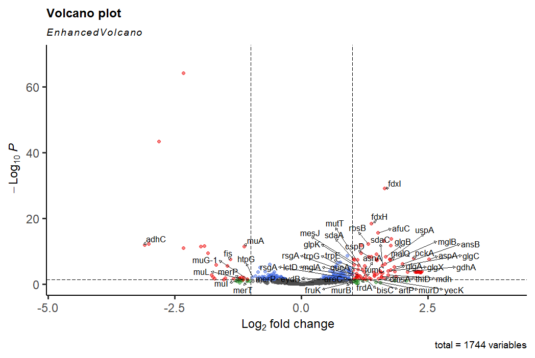
By the end of data workshop 3 you created a volcano plot highlighting the transcriptomic changes in Hi when grown in starvation conditions (MIV). Remember that the way we induce the Hi competence response in the lab is by starving the cells.
Starving the cells obviously has a knock on impact - the cells are not just inducing the competence response, but are also turning on pathways needed to synthesise/process the metabolites they need which were previously coming from the rich media (BHI). One of the challenges is we want to know what is the competence response, and what is a general stress response.
# let's regenerate your volcano plot from last time, just to check everything is working
library(ggplot2)
library(EnhancedVolcano)

# explicitly load ggrepel if it doesn't come with the two above
#library(ggrepel)

# define the list of significant genes to add as plot labels
withsymbols <- dds_tpm[- grep("[.]", dds_tpm$symbol),]
siggenes <- head(withsymbols |> arrange(desc(abs(log2FC))), 60)$symbol

# generate the plot
EnhancedVolcano(dds_tpm, x = "log2FC", y = "padj", FCcutoff = 1, pCutoff = 0.05,
                lab = dds_tpm$symbol, selectLab = siggenes, labSize = 4.5, max.overlaps = 1000, drawConnectors = TRUE,
                legendPosition = 0, gridlines.major = FALSE, gridlines.minor = FALSE)

## some people had an issue with EnhancedVolcano() last time
# this error was only in terms of RStudio producing the plot, that's why ggsave() worked
# if you are still having problems, you could try the direct ggplot way to make a volcano

# create new column stating whether a gene is sig up or down, or not
dds_tpm$DEA <- "NO"
dds_tpm$DEA[dds_tpm$log2FC > 1 & dds_tpm$padj < 0.05] <- "UP"
dds_tpm$DEA[dds_tpm$log2FC < -1 & dds_tpm$padj < 0.05] <- "DOWN"

# complex plotting
# first line is the plot, decond gives the colours and no legend, third defines the colours
# fourth line gives the threshold lines, fifth gives a clean white background, sixth sets the labels
ggplot(dds_tpm, aes(x=log2FC, y=-log10(padj))) +
  geom_point(aes(colour = DEA), show.legend = FALSE) +
  scale_colour_manual(values = c("blue", "gray", "red")) +
  geom_hline(yintercept = -log10(0.05), linetype = "dotted") + geom_vline(xintercept = c(-1,1), linetype = "dotted") +
  theme_bw() + theme(panel.border = element_blank(), panel.grid.major = element_blank(), panel.grid.minor = element_blank(), axis.line = element_line(colour = "black")) +
  geom_text_repel(data=subset(withsymbols, abs(log2FC) > 3), aes(x=log2FC, y=-log10(padj), label=symbol), max.overlaps = 1000)
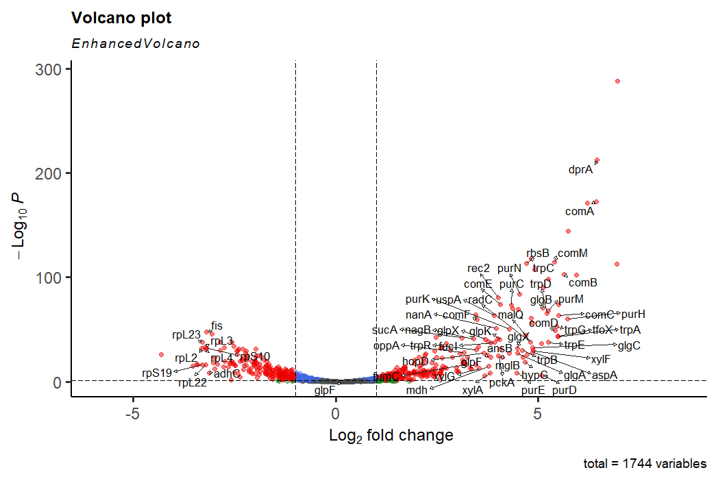
As we explored last time, there are geners upregulated here related to competence ( e.g. comA) and DNA binding and recognition ( e.g. dprA), but there are also genes involved in tryptophan metabolism, purine metabolism and carbohydrate metabolism, among others. Are these genes simply a starvation response?
We could test this (slowly) by looking up genes individually. But a better (faster) way to do this is gene set enrichment analysis (GSEA). This is very similar to gene ontology (GO) analysis, but standard GO typically only considers unordered gene lists, rather than the ranked lists we will provide (ranked by fold change).
GSEA
GSEA relies on curated gene lists which have a shared function, shared cellular localisation, or other shared feature. This means lists are fundamentally biased, and are only reliable on model organisms. Hi is not a model organism, so we'll have to make do with E. coli lists instead.
Can you think of any problems caused by relying on E. coli?
E. coli will have homologues of many of the genes we're interested in, but not all - is E. coli naturally competent? Could this influence our interpretation?
Major biochemical pathways will be covered well, and E. coli is studied a lot, so we should get the main players, but we have to be careful on our interpretation.
Not all genes have symbols. If we had a specific Hi gene set database, that's fine. But we need to convert to E. coli IDs, so we lose lots of information.
BiocManager, then we create our curated and ranked gene list, then we run the GSEA algoirthm.
# install BiocManager if you need to, otherwise just load it
# install.packages("BiocManager")
library(BiocManager)

# install and load the following packages
# remember, skip any updates, usually by typing "n" when prompted
BiocManager::install("clusterProfiler")
BiocManager::install("enrichplot")
library(clusterProfiler)
library(enrichplot)

# install and load the E. coli gene set information
organism  <- "org.EcK12.eg.db"
BiocManager::install(organism)
library(organism, character.only = TRUE)

## for clusterProfiler, we need an array with the log2FC values in descending order
# we want symbol names, and we need to get rid of genes where there is no symbol
# and get rid of tRNA and rRNA genes
# and get rid of any genes where the symbol appears more than once

# remove genes without a symbol
symbols_only <- dds_tpm[- grep("[.]", dds_tpm$symbol),]

# order the genes by symbol and by log2FC before removing duplicate lines
symbols_only <- symbols_only[order(symbols_only[,"symbol"],-symbols_only[,"log2FC"]),]
symbols_only <- symbols_only[!duplicated(symbols_only$symbol),]

# remove rRNA and tRNA
symbols_only <- symbols_only[- grep("ribosomal_RNA", symbols_only$description),]
symbols_only <- symbols_only[- grep("tRNA", symbols_only$symbol),]

# use this filtered set to create the gene_list for GSEA
gene_list <- symbols_only$log2FC
names(gene_list) <- symbols_only$symbol
gene_list <- sort(gene_list, decreasing = TRUE)

# run GSEA
# this will give warnings, but don't worry (unless there are errors, rather than warnings)
# run GSEA
gse <- gseGO(geneList = gene_list, ont = "ALL", keyType = "SYMBOL",
             minGSSize = 3, maxGSSize = 800, verbose = FALSE,
             pvalueCutoff = 0.05, OrgDb = organism, pAdjustMethod = "none")

# store useful results
gsearesults <- gse[,c("Description","setSize","qvalue","NES","core_enrichment")]

# create a list of the most significant (by q value)
gsearesults_top <- head(gsearesults[order(gsearesults$qvalue),], 40)
gsearesults_top <- gsearesults_top[order(gsearesults_top$NES, decreasing = TRUE),]

# take some time to view and explore these results - what do they tell you?
A few points on interpretation here.
- GSEA works by ordering the genes (from biggest to smallest log2FC in our case) and then seeing if particular lists of genes ("gene sets") occur closer to either end of the ranked list than you would expect by chance.
- A gene set found mostly at the high log2FC end is an "enriched" gene set in our data, and the opposite for suppressed pathways.
- You could spend ages refining the gene sets - better to use this to get the global picture of the transcriptomic changes.
- The enrichment score (ES) is a score generated by how many genes appear close together in the rankings. This means you get higher scores if many genes are close together, but also if there are lots of genes in a set (say 200 vs a set of 8). This is why you have a normalised enrichment score (NES), which accounts for the differences in set size.
- The description can be a bit vague. Sorry! You can get more information from the "leading edge" (aka "core_enrichment") genes - as these are the ones which contribute to the ES. You'll see that many overlap between different gene sets.
- When you report GSEA results, give the gene set description, NES and q value (the adjusted p value).
Let's summarise these GSEA results with some plots.
# create summary dotplot
dotplot(gse, showCategory=10, split=".sign") + facet_grid(.~.sign)

# remember to save plots of interest
ggsave("plots/MIV0MIV2_GSEA_dotplot.pdf")

# create GSEA enrichment plots for individual processes
# these are based on gsearesults dataframe order, not gsearesults_top
# plot the most enriched gene set
gseaplot(gse, by = "all", title = gse$Description[1], geneSetID = 1)
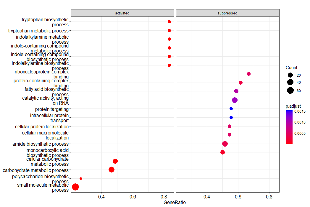
Here we have the top 10 terms for enriched gene sets (activated) and suppressed ones. Size of the circle represents how many genes are in each set, with the gene ratio saying how many contributed to the ES in our data. The colour indicates the significance. There's lots of customisation available here.
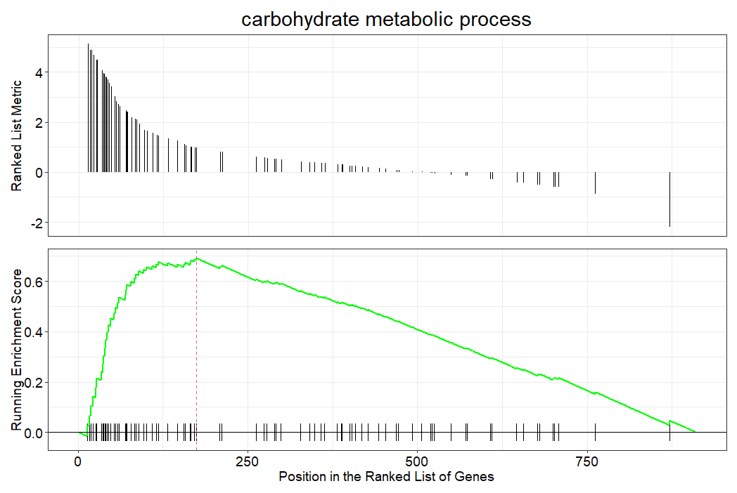
This two panel plot is how the individual gene set enrichment scores are calculated. On the x axis at the bottom, the vertical lines show the position of each gene in the ranked log2FC order. The green line is the ES building up and up based on the spacing of gene set genes in the rank list, eventually peaking (this is the ES). The top panel shows the rank position against the metric for ranking (the fold change).
The GSEA really highlights the starvation response - increases in sugar, amino acid and small molecule metabolism, and decreases in protein synthesis. Nothing about competence? But is that a surprise?
# check for gam in any leading edge gene set
gsearesults[grep("gam", gsearesults$core_enrichment),]

# check for any pathway labelled competence
gsearesults[grep("Competence|competence", gsearesults$Description),]

# It wasn't there to be found...
# But, as predicted, GSEA (using E. coli genes...) does show the big metabolic shifts
Nutrient deficiency response without the competence response?
An unfortunate consequence of our model system is that we induce many transcriptomic changes by altering the media - not just the competence response. We want to study just the biology of competence, so can we control for this added noise in the system?
One way is to include another differential expression analysis where only the nutrient stress response may be present, effectively allowing you to subtract the starvation response from the competence + starvation response we already have.
From our other available data (check back to the workshop 3 introduction), we have cells growing in rich media (BHI) but where the cell density is getting high - so where nutrients may be becoming sparse (without being so sparse it induces the same response as being in the starvation MIV media).
We will now run DEA on the BHI3 (most dense) cells against the MIV0 control (not dense; same control as our original) to try and tease out the specific competence response. Think about this - is this a good comparison to make, is it the most informative from the data we have?
Regardless, let's jump in.
# this should follow fairly closely to workshop 3
# think about what is happening at each step, and ask us about the biology if needed!

# extract appropriate TPM subset
condcomp_tpms <- tpms[, grep("kw20.MIV0|kw20.MIV2|kw20.BHI3", colnames(tpms))]

# check sample diversity with PCA
condcomp_pca <- princomp(log10(condcomp_tpms+1))
condcomp_pcavar <- round((data.frame(condcomp_pca$sdev^2/sum(condcomp_pca$sdev^2)))*100,2)
colnames(condcomp_pcavar) <- "var_perc"
condcomp_pcavar

# create variables needed for plotting
condcomp_pcacomps <- data.frame(condcomp_pca$loadings[, c("Comp.1", "Comp.2")])
pca_x <- paste(c("PC1 ("), condcomp_pcavar["Comp.1",], c("%)"))
pca_y <- paste(c("PC2 ("), condcomp_pcavar["Comp.2",], c("%)"))

# plot the samples using PC1 and PC2 (as these explain most of the variance)
ggplot(condcomp_pcacomps, aes(x=Comp.1, y=Comp.2)) +
  geom_point() +
  geom_text_repel(label=rownames(data.frame(condcomp_pca$loadings[, 1:2]))) +
  labs(x = pca_x, y = pca_y)
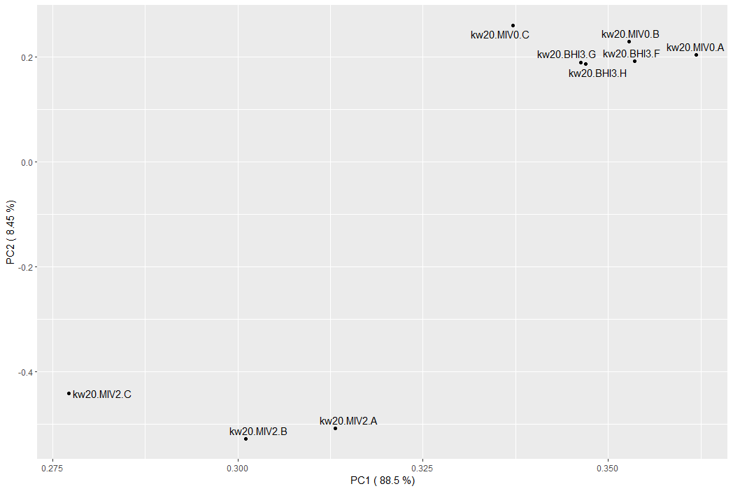
What does the PCA tell us about our samples? (check back to last week if you need a comparison)
MIV0 and MIV2 appear very different (as we saw last week), but the MIV0 and BHI3 samples are interspersed. This could suggest they are very similar, and therefore unlikely to show many significant differences.
You could drop the MIV2 samples and re-do the PCA - does this show a difference now?
# PCA doesn't tell you everything - let's carry on and run DEA for these two conditions

# install DESeq2 if you need to (skipping updates again)
#BiocManager::install("DESeq2")
library(DESeq2)

# extract count subset
MIV0BHI3_counts <- counts[, grep("kw20.MIV0|kw20.BHI3", colnames(counts))]

# generate sample info for DEA
sample_info <- data.frame(colnames(MIV0BHI3_counts))
colnames(sample_info) <- c("sample")
rownames(sample_info) <- sample_info$sample
sample_info <- sample_info |> separate(sample, c("genotype", "condition", "replicate"))

# if you run into issues with separate the following line replaces the whole block above
# sample_info <- read.table(text=gsub("[.]", ",", colnames(MIV0BHI3_counts)), sep=",", col.names=c("genotype", "condition", "replicate"), row.names = colnames(MIV0BHI3_counts))

# generate DESeq2 object
MIV0BHI3_dds <- DESeqDataSetFromMatrix(countData = MIV0BHI3_counts, colData = sample_info, design = ~ condition)
MIV0BHI3_dds$condition <- relevel(MIV0BHI3_dds$condition, ref = "MIV0")
MIV0BHI3_dds <- DESeq(MIV0BHI3_dds)
MIV0BHI3_dds_results <- results(MIV0BHI3_dds)

# merge with features
MIV0BHI3_dds_results <- merge(as.data.frame(MIV0BHI3_dds_results), featname, by=0)
rownames(MIV0BHI3_dds_results) <- MIV0BHI3_dds_results$Row.names
MIV0BHI3_dds_results <- MIV0BHI3_dds_results[,-1]

# subset TPMs, calculate log2FC, merge
MIV0BHI3_tpms <- condcomp_tpms[, -grep("MIV2", colnames(condcomp_tpms))]

# due to a dependency issue, explictly call dplyr in the select call
MIV0BHI3_tpms <- mutate(MIV0BHI3_tpms, MIV0_avg = rowMeans(dplyr::select(MIV0BHI3_tpms, contains("MIV0"))),
                        BHI3_avg = rowMeans(dplyr::select(MIV0BHI3_tpms, contains("BHI3"))))
MIV0BHI3_tpms <- mutate(MIV0BHI3_tpms, log2FC = log2((BHI3_avg+1)/(MIV0_avg+1)))

MIV0BHI3_dds_results <- merge(MIV0BHI3_dds_results, MIV0BHI3_tpms, by=0)
rownames(MIV0BHI3_dds_results) <- MIV0BHI3_dds_results$Row.names
MIV0BHI3_dds_results <- MIV0BHI3_dds_results[,-1]

# extract genes with symbols (and not rRNA genes), and then the most significant genes
MIV0BHI3_withsymbols <- MIV0BHI3_dds_results[- grep("[.]|HI_", MIV0BHI3_dds_results$symbol),]
MIV0BHI3_siggenes <- head(MIV0BHI3_withsymbols |> arrange(desc(abs(log2FC))), 50)$symbol

# plot - with EnhancedVolcano() or ggplot()
EnhancedVolcano(MIV0BHI3_dds_results, x = "log2FC", y = "padj", FCcutoff = 1, pCutoff = 0.05,
                lab = MIV0BHI3_dds_results$symbol, selectLab = MIV0BHI3_siggenes, labSize = 4.5, max.overlaps = 1000, drawConnectors = TRUE,
                legendPosition = 0, gridlines.major = FALSE, gridlines.minor = FALSE)

# you could choose to do GSEA on this comparison now
# adapt the code from above
Another volcano! But this time far fewer significantly different genes.
Those that are different, again highlight increases in carbohydrate and amino acid metabolism, but we don't see the competence or DNA recognition genes - perhaps this control has worked!
Look at the downregulated genes - mu!
gam doesn't come up at first glance, but muA, MuI and muL all do, and they're in the same operon. Interesting!
One thing to say here is that we are resolutely ignoring some genes with the biggest changes, both in last week's work and here. We are only looking at stuff with symbols, but we could be ignoring some interesting biology. These could be quite well studied genes, but they just haven't been named properly in Hi yet... Let's flip our focus for a minute.
# focus only on genes without a symbol, using the HI identifiers in the row names
MIV0BHI3_withoutsymbols <- MIV0BHI3_dds_results[grep("[.]", MIV0BHI3_dds_results$symbol),]
MIV0BHI3_withoutsymbols_sig <- rownames(head(MIV0BHI3_withoutsymbols |> arrange(desc(abs(log2FC))), 10))

# plot the volcano if you like, make sure to change the lab and selectLab flags (think rownames again...)
# or just view the MIV0BHI3_withoutsymbols_sig dataframe
# HI_1456 and HI_1457 have massive changes!
So what are these? The HI_1457 gives a bit of a hint with "opacity protein". You could google this, but some features may be less informative - HI_1456 just says "predicted coding region", for example.
What I have also made available to you is the nucleotide sequence of each feature in your counts dataframe - Hi_feature_sequences.fa - so you could open this file in notepad, or wherever and extract the nucleotide sequence you're after. You could then use this as a query for NCBI's blastx, which uses a translated version of your nucleotide query against a protein database (as in, it converts the nucleotides in your query to protein to get more diverse search results). What does this tell you - could this give you more information on some of the big changing genes in your DEA results?
Can we extract a competence-specific response?
Quick reminder of what we're attempting to do. In workshop 3, we looked at the induced competence response in Hi using starvation medium. But. This also gave a starvation response. Today, we've compared the same control samples to cells growing in greater density, so the cells may be starting to face nutrient limits, without it causing so much stress you get the full stress (starvation + competence) response we had before.
Now we have both these comparisons, we can attempt to subtract the nutrient limit response to leave just genes involved in competence.
# rename columns we want to compare from each DESeq output
MIV0BHI3_DEA <- MIV0BHI3_dds_results[, c("log2FC", "padj", "symbol")]
colnames(MIV0BHI3_DEA) <- c("MIV0BHI3_log2FC", "MIV0BHI3_padj", "symbol")
MIV0MIV2_DEA <- dds_tpm[, c("log2FC", "padj")]
colnames(MIV0MIV2_DEA) <- c("MIV0MIV2_log2FC", "MIV0MIV2_padj")

# now names are unique, merge the columns of interest, extract features with symbols
dea_comp <- merge(MIV0BHI3_DEA, MIV0MIV2_DEA, by=0)
rownames(dea_comp) <- dea_comp$Row.names
dea_comp <- dea_comp[,-1]
dea_comp_symbols <- dea_comp[- grep("[.]", dea_comp$symbol),]

# correlate the log2FC values between the two comparisons
cor(dea_comp$MIV0BHI3_log2FC, dea_comp$MIV0MIV2_log2FC, method = c("pearson"))

# plot two DEAs against each other using log2FC values
ggplot(dea_comp, aes(x=MIV0BHI3_log2FC, y=MIV0MIV2_log2FC)) +
  geom_point() +
  geom_text_repel(data=subset(dea_comp_symbols, abs(MIV0MIV2_log2FC) > 3 & abs(MIV0BHI3_log2FC) < 1), aes(x=MIV0BHI3_log2FC, y=MIV0MIV2_log2FC, label=symbol), max.overlaps = 1000, colour="red") +
  geom_abline() + geom_hline(yintercept = 0) + geom_vline(xintercept = 0) +
  theme_bw() + theme(panel.border = element_blank(), panel.grid.major = element_blank(), panel.grid.minor = element_blank(), axis.line = element_line(colour = "black"))
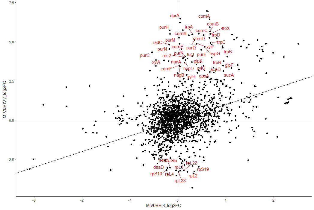
We have now compared the log2FC changes in two separate differential expression analyses.
If the transcriptomic changes were identical in both conditions, all genes would fall on the indicated y=x line. Changes which are specific to each DEA fall directly on their respective axes - y axis for MIV0 vs MIV2 and x axis for MIV0 vs BHI3. Genes near the origin do not change (much) in either comparison. There are more changes (and of greater magnitude) for the MIV0 vs MIV2, so the plot is not square - always check the axis scale.
I've chosen to highlight those genes which would not be considered as significantly different in the BHI3 comparison, but are in the MIV2 (i.e. genes close to the y axis). Here we see the competence genes like dprA and comA, and the competence transcription factor tfoX. Mess about with these thresholds and see where the carbohydrate biosynthesis genes have gone (hint - much closer to x=y).
So now we have a much reduced and more specific-to-competence list of genes. We still have the pur and trp genes - does that mean they have a more specific role in competence, rather than these nutrients being absent from the media? I recommend contextualising your results with the literature (cough, mark scheme, cough) to see whether these genes make a lot of sense.
Also, would a similar comparison with any of the other datasets be equally/more informative on the competence response?
Note. You don't have to have a shared control condition (like MIV0 in our case) in order to compare. It is useful, as having a shared condition means you have a definite (rather than potentially assumed) shared baseline. Something to mention/highlight/control for.
Full-genome summary visualisation with Circos plots
Now we have lots of information on which genes are changing we can try and summarise this data at the full genome level using a circos plot. This plots the Hi genome as a circle and then we can layer tracks on and around this circle to show the distribution of genes or particular features (e.g. regions or GC content).
Circos plots can get massive, complex and strange very quickly (check out some examples here), often becoming too complex to actually be useful. But, they are used a lot in biological data visualisation, so we'd like you to have a go. Hopefully it will also help you to link with the PHASTER results from data workshop 2.
A big problem I've faced when designing this material is that many circos plotting libraries have thousands of dependencies. We are therefore keeping it simple, so the plots you make are definitely customisable - but we're not expecting some of the incredibly complex images we can see on the front covers of scientific journals!
# install and load the BioCircos library
# the vignette and further information are here - https://cran.r-project.org/web/packages/BioCircos/vignettes/BioCircos.html
install.packages('BioCircos')
library(BioCircos)

# we will now create a list of tracks, each time adding more information
# then we visualise it all in one go

# set the plot title in the middle of the circle (you may want to mess with x and y until you are happy)
tracklist <- BioCircosTextTrack("titletrack", "Hi kw20", opacity = 0.5, x = -0.2, y = 0)

# define an arc region to indicate where the mu prophage region lies
tracklist <- tracklist + BioCircosArcTrack("prophage region", "L42023.1", 1558774, 1597183,
                                           opacities = c(1), minRadius = 1.25, maxRadius = 1.4,
                                           labels = c("mu prophage"))

# use the Hi GC content file (new raw data for this workshop) to create a GC content plot
tracklist <- tracklist + BioCircosLineTrack("GC", "L42023.1", gc$start, gc$GC,
                                            minRadius = 0.4, maxRadius = 0.68, color = "black",
                                            labels = c("GC content"))

# we will now merge our MIV0 vs MIV2 (data workshop 3) DEA results with the feature locations, retaining useful columns
# this means we will be able to view our log2FC values as a genome-distributed heatmaps
dea <- merge(dds_tpm, featlocs, by=0)
rownames(dea) <- dea$Row.names
dea <- dea[,c("symbol", "log2FC", "chr", "start", "end", "strand")]

# use this to create a new heatmap track
# the colors form a red to blue gradient (from high pos to low neg log2FC)
# pick colours you like!
tracklist <- tracklist + BioCircosHeatmapTrack("DEA", "L42023.1",
                                               dea$start, dea$end, dea$log2FC,
                                               minRadius = 0.8, maxRadius = 0.95,
                                               color = c("#FF0000", "#0000FF"),
                                               labels = c("MIV0vsMIV2 DEA"))

# I'm only showing one heatmap track here - this could be another good way to highlight regions of the genome
# which are up or down in different condition comparisons...

# finally, render the circos plot
BioCircos(tracklist, genome = list("L42023.1" = 1830138), genomeLabelTextSize = 0,
          genomeTicksScale = 1e5, genomeTicksTextSize = 12)

# remember to save
ggsave("plots/circos.pdf")
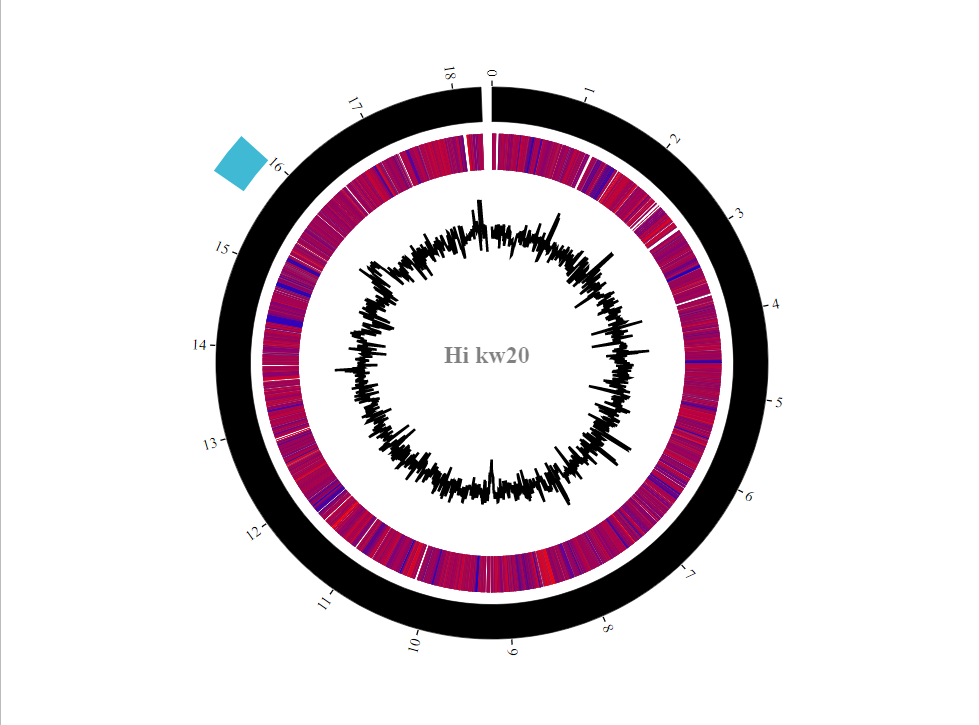
As so many genes were upregulated in the MIV2 condition relative to MIV0, the heatmap looks pretty warm. If you add another heatmap track with today's BHI3 vs MIV0 comparison, you should start to see those regions which are consistently up between conditions (i.e. carbohydrate metabolism) and those which are up only in the competence-inducing conditions (i.e. comA, dprA). Nice to have the GC plot too to get some genome-level descriptions. GC content always fluctuates, but the mean values are often quite species-specific. Interesting that the prophage region has a higher than Hi-average content - pretty good supporting evidence for this actually being a phage integration, rather than convergent evolution. You can include gene density or TF binding site density as line tracks in this way too.
The BioCircos functionality is pretty limited, so you might want to label a few genes manually on top of your generated figure. Similarly, it would be good to add a little scale bar to the GC content track - you can extract the min and max values from the gc dataframe.
Sometimes coding a figure to exactly how we want it is very very hard, and not worth the effort when you can add labels manually. Always consider how much time you sink into a task (often compared with how many times you are likely to do that task).
We can label up specific regions on a circos plot very easily, such as the prophage region. Think about how you might link figures from different parts of the practicals and data workshops. Remember, you don't have to report your results in the order you did them - think about the narrative. In this case the given order is pretty sensible - but always think about your structure for maximum clarity.
Now we've started to consider the spatial organisation of genes in the Hi genome, and we're looking at the prophage region again, we can ask whether the RNAseq data directly informs your outstanding diagnostic PCR questions.
Can the sequencing data show us if muA, muB and gam are transcribed together?
An outstanding question from your diagnostic PCR practical is whether muA, muB and gam are explicitly transcribed together. Our short read sequencing data has the potential to answer this question by looking to see if these genes (and other in the mu prophage region) are more closely correlated with each other than with distant genes. Let's look.
install.packages("sjmisc")
library(sjmisc)

# rotate tpm dataframe to get features as columns
t_tpms <- tpms |> rotate_df()

# create a correlation matrix against the gam feature (HI_1483)
gam_tpm_cor <- cor(as.matrix(t_tpms[,c("gene-HI_1483")]), as.matrix(t_tpms))
gam_cors <- as.data.frame(gam_tpm_cor[,order(-gam_tpm_cor[1,])])
colnames(gam_cors) <- c("gam_cor")

# add in symbols where possible
gam_cors <- merge(gam_cors, featname, by=0)
rownames(gam_cors) <- gam_cors$Row.names
gam_cors <- gam_cors[,-1]
gam_cors <- gam_cors[order(-gam_cors$gam_cor),]
head(gam_cors, 25)

# look at all those mu genes, or those without symbols but numerically close HI IDs

# add in location information
gam_cors <- merge(gam_cors, featlocs, by=0)
rownames(gam_cors) <- gam_cors$Row.names
gam_cors <- gam_cors[,-1]

# create column with distance between gam st/end, accounting for circular genome
# gam is found at coordinates 1565297-1565806
# genome is 1830138 bp - features at coordinate 10 are closer if you measure across the 'top' of the circle
gam_cors <- mutate(gam_cors, gam_circ_dist = ((start+1830138)-1565806), gam_noncirc_dist = abs(1565297-start))
gam_cors <- transform(gam_cors, min_gam_dist = pmin(gam_circ_dist, gam_noncirc_dist))

# sort and subset columns before plotting
gam_cors_top <- (gam_cors[order(-gam_cors$gam_cor),])[,c("gam_cor", "symbol", "min_gam_dist")]
ggplot(gam_cors_top, aes(x=log10(min_gam_dist+1), y=gam_cor)) +
  geom_point() +
  geom_text_repel(data = gam_cors_top |> mutate(label = ifelse(gam_cor > 0.87, rownames(gam_cors_top), "")), aes(label = label), max.overlaps = 100) +
  theme_bw() + theme(panel.border = element_blank(), panel.grid.major = element_blank(), panel.grid.minor = element_blank(), axis.line = element_line(colour = "black"))
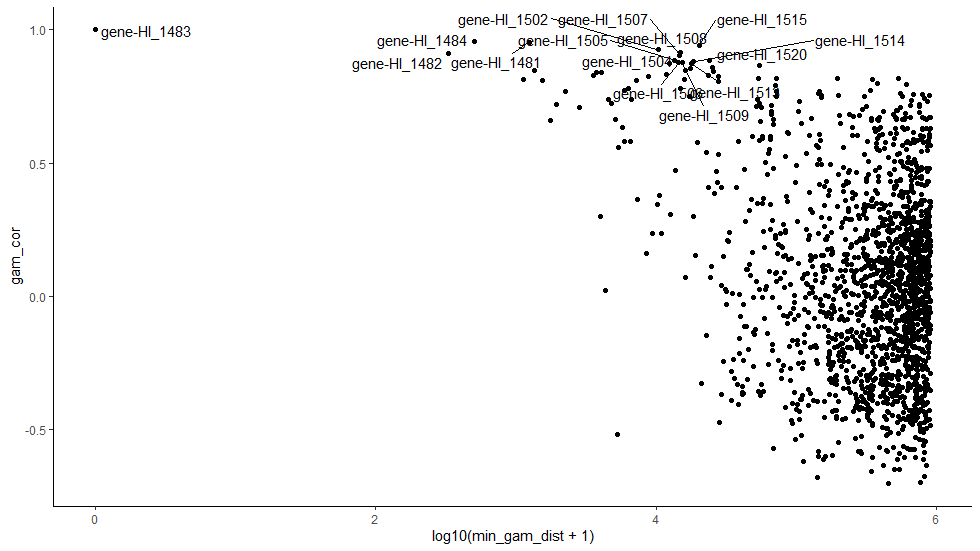
This plot shows correlation values between the expression of different genes and gam (y axis) and how far away from gam each of those genes is (x axis). Most genes are quite a long way from gam (>100,000 bases away; >10^5 bases) and have varying to little correlation. However, genes closest to the prophage region are well correlated with gam.
This suggests there is a strong positional effect to expression across the mu prophage region.
But does this actually prove they are transcribed together?
No! For bacteria, such a good correlation is highly suggestive, but again, non-conclusive.
Can you think of a sequencing-based technology that could resolve this?
Long read sequencing. In theory these methods capture the entire length of a transcript, even if that is an entire operon. For such a specific question (which could be solved with the right PCR primers...), long read sequencing is probably expensive overkill, unless you wanted to confirm other co-transcribed regions at the same time. Always think about narrow vs broad use in the context of financial decisions in experimental planning.
Finishing up for today
The aim of today was to reinforce and expand on data workshop 3, and start to properly integrate the biological interpretation of the data. Well done! Your coding skills have now taken you from a single dataframe of counts to multi-condition comparisons, gene set enrichment analysis and integration with the literature. This is a real expansion of your coding skills and an opportunity to have worked with big data.
Before you finish today, make sure you understand why you have been doing this analysis - chat with the demonstrators - does it all link together in your head, particularly for making a single narrative with your wet lab work? Also: save, save, save and make lots of comments on your code!
Expansions to the project
Some ideas for expanding your analysis to improve your understanding of Hi competence (and likely your grade simultaneously):
- Use other conditions in the provided dataset.
- Explore significant features which lack a gene symbol.
- Add in more plots which help you to explore the data - heatmaps, networks, bar graphs etc.
- Further biological exploration - GSEA, pathways, KEGG etc.
- Anything else cool you can think of!
Tips for the RStudio Project
- One single cohesive project - likely with a single .R script file and sensible directories
- Clear commenting which is relevant to understanding the code
- Include plots and printing you did to check the data and make your next decisions - don't include the 6 times you misspelt something and got errors
- Include your
library()lines, but comment out any installation lines - Don't load in the 2 processed data files I gave you at the start of this workshop - work with the raw data
- Sensible naming, including for plots
- Clear and consistent style (spaces, indentations etc.) - keepi it legible.
- I won't penalise you for not using complex loops, only if code was repeated multiple times without need (efficiency and conciseness)
Return to tutorial introduction.
Video explainers
Introduction to transcriptomics
This video was included in the week 4 teaching materials on the VLE to view before the workshop - hopefully this is just here as a reminder. Here we introduce you to some of the concepts of transcriptomics - where the data comes from, what it looks like, and what you'll be doing with it in the data workshops.
Return to tutorial introduction.
Begin the workshop.
Data processing before this workshop
This video was included in the week 5 teaching materials on the VLE to support the workshop material. We introduce you to the data you will analyse in these two data workshops (3 and 4), and tell you what has happened to go from raw sequencing data (files for each sample total c.40 million lines) to the counts matrix you will work on (1745 rows and 6 columns, in the first instance).
Return to tutorial introduction.
Begin the workshop.
What is a sequencing read
This video was included in the week 6 teaching materials on the VLE to support the workshop material. We had some confusion as to what a sequencing read actually is - so hopefully this explainer helps.